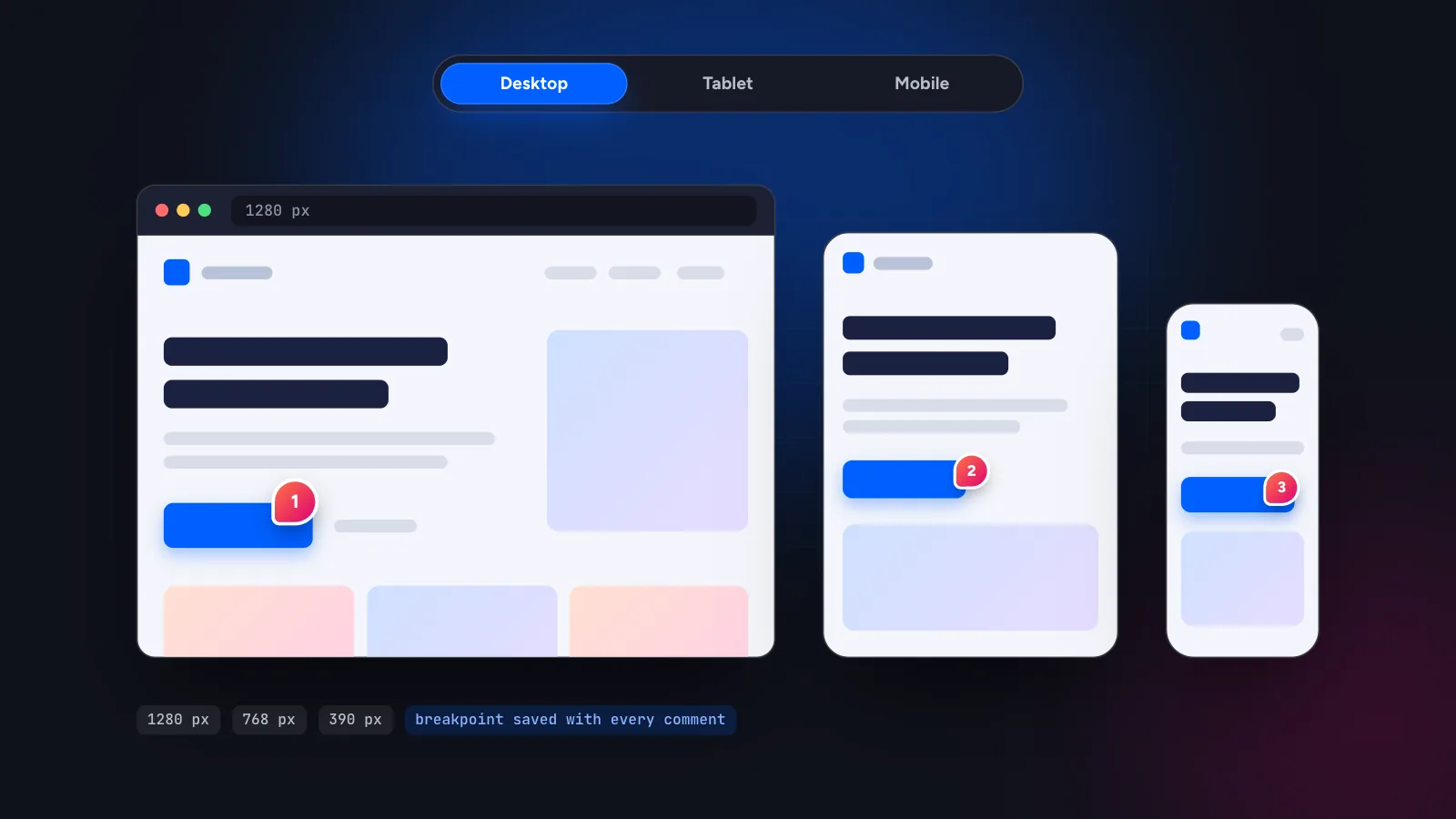
To collect client feedback on a responsive website, let the client comment on the page at each screen size (desktop, tablet and mobile) and make sure every comment records which breakpoint it was made on. Then the developer, or an AI coding agent, knows which layout to change and does not break the others.
In this guide
Why responsive feedback goes wrong
A client opens the site on a laptop, then on a phone, and writes one email: “the menu is broken”. Which menu? Which phone? Is the problem the hamburger icon, the spacing or the fact that it does not open? The developer opens the site on a desktop, sees nothing wrong and replies “works for me”.
This happens because responsive sites are several layouts sharing one codebase. A comment is only useful if it says which layout it is about. Screenshots help a little, but they do not tell you the viewport width, and a developer cannot search a screenshot for a CSS rule.
Which sizes to review
You cannot test every device, so test the widths where layouts usually change. A sensible default is three:
- Desktop, about 1280 px. The full layout: multi-column sections, hover states, wide images.
- Tablet, about 768 px. Often the awkward middle: columns that no longer fit, navigation that has not collapsed yet, images that are too large.
- Mobile, about 390 px. One column, a collapsed menu, larger touch targets and long words that overflow.
Your site’s own breakpoints may differ. If your CSS changes the layout at 1024 px or 480 px, add those widths too. The goal is one pass per layout, not per device model.
A process that works for clients
- Send one link. In Symu 2 you paste the site URL and share the project link. The client does not need an account, only a name.
- Ask for one pass per device. Tell the client: “Please go through the main pages once on desktop, once on tablet and once on mobile.” The preview switcher in the tool makes that easy, even from a laptop.
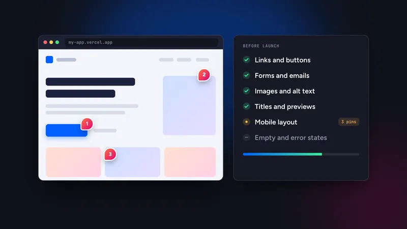
- Let them point instead of describe. The client clicks the element and types what is wrong. The pin attaches to the real element, and the comment stores page URL, selector, XPath, an HTML snippet and the breakpoint.
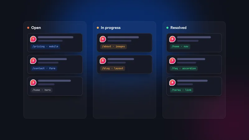
- Collect everything before fixing. Comments become tasks with statuses. Triage them once, group related items and fix in a batch.
- Send the same link for verification. The client reloads, checks each resolved item at the same size and confirms or reopens it.
This is the same approach we describe for collecting client feedback without a script, with the breakpoint made explicit.
What good responsive feedback says
Even with the breakpoint stored automatically, the words still matter. Good comments state the problem and the desired outcome for that size.
- Weak: “Header looks bad on phone.”
Better: “The logo and menu icon overlap. Keep the logo on the left and the icon on the right.” - Weak: “Text is too small.”
Better: “Body text in this section is hard to read. Make it the same size as the other sections.” - Weak: “Button is cut off.”
Better: “The button label wraps and the second line is clipped. Allow the button to grow or shorten the label.”
For a fuller treatment see how to write feedback that an AI agent can act on. The same rules help human developers.
Fixing without breaking other layouts
The classic regression is fixing the phone and breaking the desktop. Two habits prevent most of it.
Scope the change to the breakpoint
When a comment is tagged mobile, change the mobile rules: inside the relevant media query, or with the mobile-first base styles, depending on how the CSS is written. If you use an AI coding agent through MCP, say so in the prompt: “Only change styles that apply below 768 px.” The agent can read the breakpoint on each comment, so it can filter on it directly. The Claude Code setup guide has a prompt for exactly this.
Re-check all three sizes
After a fix, look at the same section at all three widths, not just the one in the comment. It takes a minute in a preview switcher and catches the cases where a shared class was edited.
A short checklist per breakpoint
Give reviewers, whether clients or teammates, a few things to look for at each size. It keeps the feedback focused and avoids the vague “looks off”.
Desktop
- Are columns aligned and are line lengths comfortable to read?
- Do hover states, dropdown menus and sticky headers behave?
- Are images sharp on a large screen and not stretched?
Tablet
- Does the navigation fit, or has it collapsed too early or too late?
- Do multi-column sections wrap into a sensible layout?
- Does the page work in both portrait and landscape?
Mobile
- Is there any horizontal scrolling or text running off the screen?
- Can you reach and use the menu, forms and buttons with a thumb?
- Do long headings, tables and code blocks stay inside the screen?
With a stored breakpoint on every comment, you can also filter the task list by device. Fix all the mobile items in one sitting, then re-test mobile, then move on.
Setting expectations with the client
Most responsive feedback problems are really expectation problems. A client who has only ever seen the site on one screen assumes the others are copies of it. Say up front that the site adapts to each width, that the mobile version is not a shrunken desktop page, and that you want comments on each. Tell them how long the pass should take, and ask them not to resize the browser window by hand, because the preview switcher gives consistent widths.
It also helps to agree on what “fixed” means for mobile. A navigation that opens, text that fits, buttons that can be tapped and no sideways scrolling is a good, testable definition, and it keeps the conversation away from pixel-level preferences that belong in a design round, not a QA round.
Limits of reviewing in a browser
A device switcher resizes the page and applies your CSS at that width. It is very good for layout, spacing and text wrapping. It is not a real phone. Touch behaviour, browser toolbars that change the viewport height, notches, iOS-specific quirks and slow mobile networks still need a check on a real device before launch. A URL-based tool also needs the site to be reachable from the internet and does not support pages behind a login.
Use the in-tool review for the bulk of the work, then do a short pass on one real phone. Our pre-launch checklist and agency QA checklist include that step.
Start the 14-day free trial, paste your site’s URL and try the desktop, tablet and mobile switcher on a real project.